Quick Tips on Designing Your Kafka Summit Presentation
Written by Viktor Gamov -

Do yourself a favor and grab a copy of «Presentation Patterns» book by Neal Ford, Matthew McCullough, Nathaniel Schutta and should be good to go and crush your next tech presentation.
| Version | Date | Comments |
|---|---|---|
v1.0 |
103/15/2019 |
Initial revision |
Preface
Kafka Summit 2019 events are in full throttle. New York event is happening in a couple weeks. London event is happening shortly after that in May. And San Francisco Kafka Summit is open for speaker’s proposals. My DevX team at Confluent assisted with reviewing proposals. And now we’re helping many speakers with their decks.
If you’re a speaker at Kafka Summit and looking for the feedback on your slides we’re running office hours in Confluent Confluent Community slack (#summit-office-hours channel).
To take part, join the channel in our Slack community at one of these two times: March 26, 2019, at 11:00 a.m. PST and March 28, 2019, at 2:00 p.m. GMT
|
My friend and colleague Robin Moffat asked if we can come up with a list of recommended reading and example to help our speaker to improve their slide decks. And since "I ❤ blogging," I decided to take a stab of creating a list of «opinionated» (since Robin asked my opinion) recommendation!
| By all means, this is not «presenting 101» or «powerpoint 101» post. I assume that you know things. |
So here we go!
Working on slides
First of all, your slides are your little helper. Slides should help you to visually communicate ideas that you verbally will be presenting. Your presentations is a story and the slides just a tool to convey your story.
Let me start by recommended a more or less universal structure that I learned a year ago from the book «The Art of the Start.»
10/20/30
The 10/20/30 Rule of Presentations is that you should use ten slides (10) in twenty minutes (20) with a minimum of thirty-point text (it better if it’s bigger).
Guy. The Art of the Start 2.0 (p. 142). Penguin Publishing Group. Kindle Edition.
But you can say, Vik, ten slides and twenty minutes would be not enough for your 45 minute Kafka Summit talk! For tech talk, you can probably have more slides. But remember, you should be able to deliver your idea using only 10 slides in 20 minutes (if needed).
| Personally, I don’t create more slides than minutes allowed me to speak (there are some exceptions like slides as transitions, slides with some funny gifs and such) |
You shouldn’t use small fonts.
Guy Kawasaki also have a formula for optimal font size - Age of the Oldest person in the room divided by 2.
Handy formula and easy to remember.
Presentation Patterns
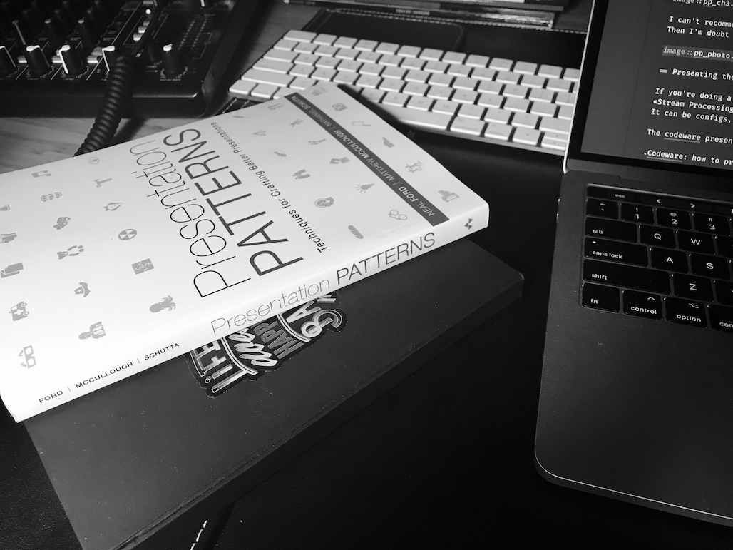
«Presentation Patterns: Techniques for Crafting Better Presentations» is one of the most impactful books in my professional career as a speaker. Written but master presenters and well-respected technologists Neil Ford, Nate Schutta, Matthew McCullough. It was set or patterns and anti-patterns [1].
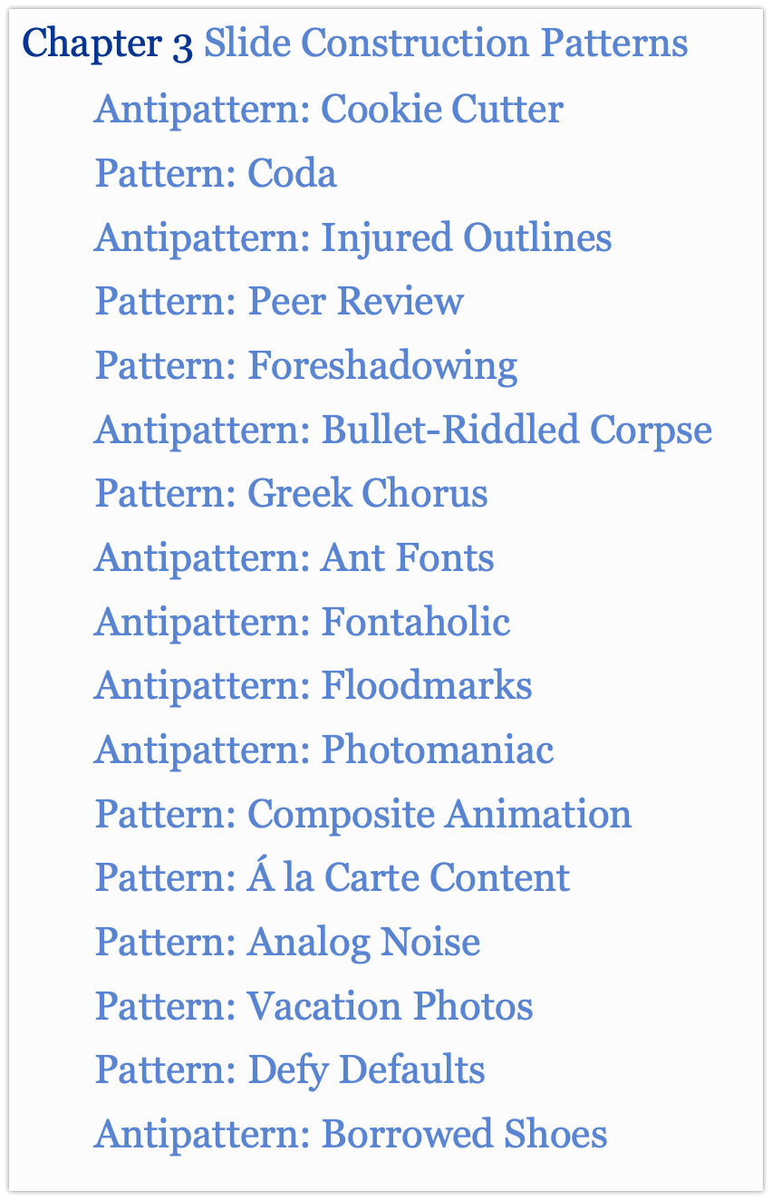
Apart from covering all aspects of your presentations (from idea to a delivery), this book has a full chapter on our subject - Slide design patterns (well, mostly anti-patterns.).
My favorite - Bullet-Riddled Corpse aka Death by Bullet points. Many presentations from my Confluent colleagues (yes, Robin and Ben and Tim, I’m looking at you) use Analog Noise pattern.
I can’t recommend this book more. Then I’m doubt or looking for inspiration. I always have this book within reach on my desk.
Presenting the code
If you’re doing a technical presentation (e.g., you’re presenting at «Core Kafka,» «Stream Processing») you must have some code to show. It can be configs, Java/Scala/name your language code, XML, JSON.
The codeware presentation is absolute must see!
Few critical takeaways from that presentation
-
Slides are not your IDE
-
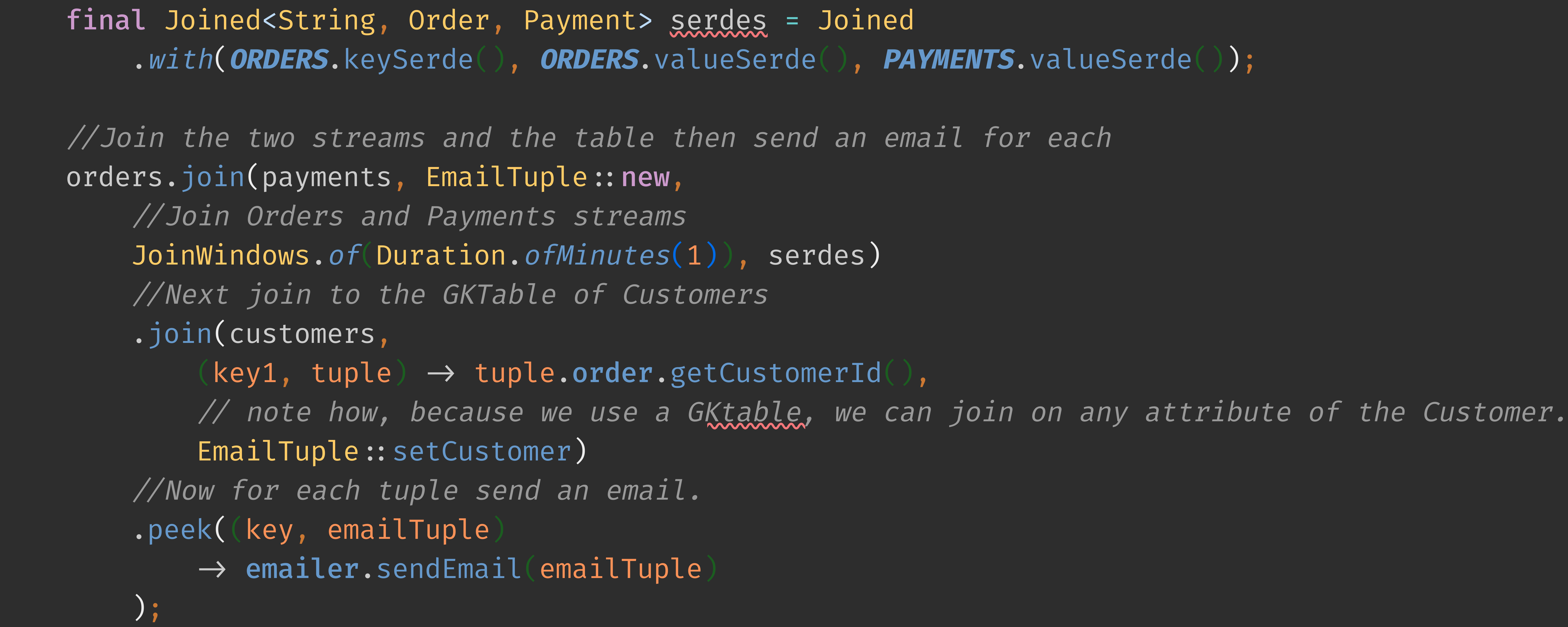
Use monospaced font for displaying your code in the slides
-
Use BIG SIZE FONT
-
Use syntax highlighting
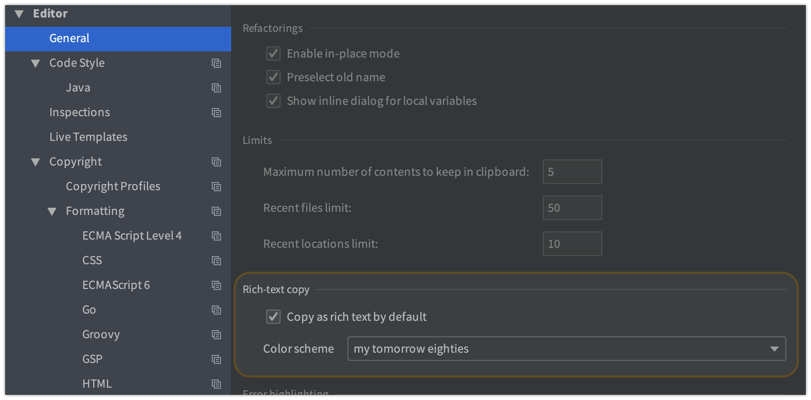
Let’s have a short detour here. I use IntelliJ IDEA for a very long time. And, apart from being The best IDEA ever, it also has some awesome plugins that may help you with your presentations. -
Built-in capability to copy the code in your IDE with the same style as you see it in your Editor window.
-
Awesome Plugin turned to build-in capability by Tagir Valeev
-
-
use ellipsis and screen annotation (because laser pointers suck!!!!)
By the way, the same author has two other presentations that you may find useful.
If you want to use pointer during your presentation get yourself a Logitech Spotlight presenter remote.
If you want to have some inspiration, I would recommend checking slides of my another friend - Developer Advocate at JetBrains Anton Arhipov.
Here are a few notable examples of his presentations with code.
Another useful tool worth to mention is Carbon Now. It’s a web app that allows you to produce beautiful screens that look like a terminal window. You can see an example in my post here. Carbon Now also has plugins for the various IDEs and editors (including one for IntelliJ IDEA).
| Robin himself wrote a blog about using Pygments library to create highlighted snippets! |
Conclusion
Your slides are not your presentation. The slides deck is the only helper. They exist only to amplify the idea that you trying to share.
I tried to make a quick brain dump here. Most likely, this post will be updating if I will remember things (or my twitter-people will recommend me something).
Let me know if it was somehow useful. I may also share some of the delivering or presenting tips.
As always, you can leave all your comments below or reach out in Twitter!